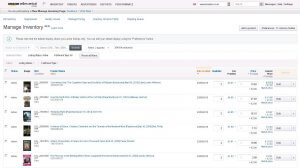
As many of you have probably noticed, there is new a Manage Inventory view available on Amazon that promises sellers an easier way to manage their inventory. Permanent migration for all sellers to the new Manage Inventory page will take place on June 15, 2015
Read more to see what’s out there
Old version vs. New version
Structural changes
While the current Show my inventory section offers a plain branching of the available views and options, the Beta version commingles the perspectives and helps you customize the overview on your inventory.
Some of the columns are now merged, providing more space to display all necessary info. The SKU and conditionProducts can only be listed on Amazon if... More are now in the same column, as well as Product Name with ASIN, which have also been merged in one column.
The Actions button was renamed, and is now called Edit. There is also a new addition to the options available in the drop down, the Match low price action. Also, some of the already existent actions have been renamed: Edit details is now called Edit, Manage product images has been shortened to Manage Images and Copy to a new product has been changed to Copy listing.
Additionally, the Preferences button now allows you to switch between the columns displayed and also to change their position.
More visibility
Completely new to this view are the thumbnail images shown in the Image column. This helps you to visually locate your items in the list. It will now be easier for you to separate let’s say toy cars from books or personal care products for instance.
Less prone to error
In the available Action section you can choose options either for individual listings, or for an entire page (you may Close listings, Delete products and listings, Convert to fulfilled by Amazon and Match low price). No confirmation is currently required for any action that you choose to perform. The Beta version however does show a pop-up message to prevent any actions done by accident from going live.
All in all this new view provides sellers an easier tool to work with, and more room to personalize the page according to their needs. The inventory section in your seller account resembles one’s personal stock files more and more, while becoming more user friendly at the same time.


