

The dreaded Seller Central beta testing phase has had a rocky start, but now that the dust has settled, let’s take a gander at how the home page layout has turned out.
To see for yourself, keep calm and carry on reading.
The Fancy Face-Lift
Amazon’s Seller Central website has gone through a major overhaul over the past few months; we’ve already touched on Valid Tracking Rates and Enhanced Reviews earlier in the series. Now let’s turn to an equally perplexing change: the transition to the new Seller Central homepage layout. Now that the initial shock is behind us, let’s see what has stayed the same, what we’ve said goodbye to, and what new features the home page boasts.
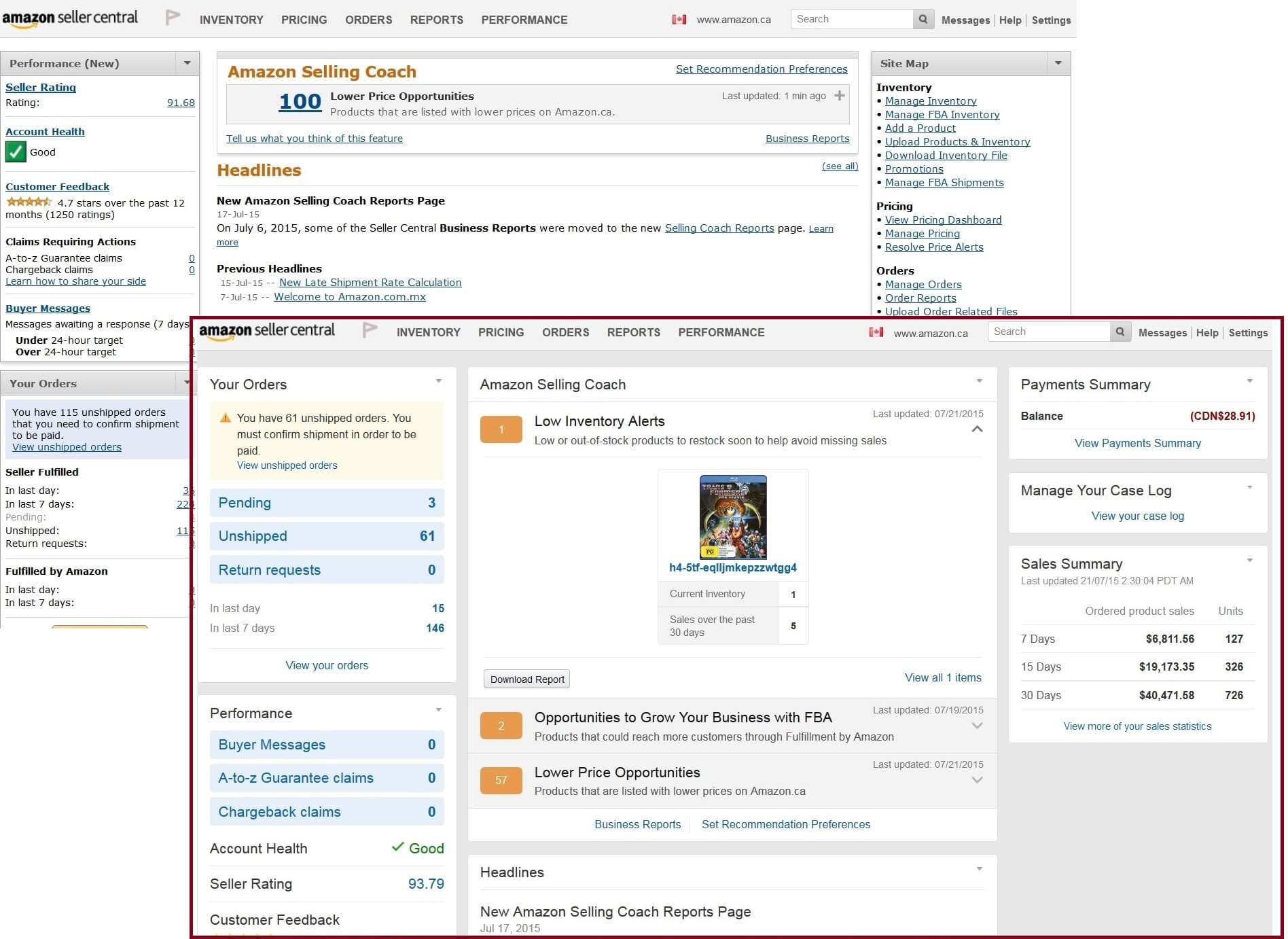
We Bid Farewell To:
- interchangeable side panels
[and say hello to]
Newfangled Features:
Left-hand side:
‘Your Orders’ section:
- now placed on the top left, where the ‘Performance’ panel used to be
- flashy alert for unshipped orders on the top on a yellow, rather than blue, background, with an exclamation sign
- three sizable boxes with ‘Pending’ and ‘Unshipped’ order counters, as well as the number of Return Requests at the top of the ‘Your Orders’ panel
‘Performance’ section:
- features three identical boxes for Buyer Messages, A-to-Z and Chargeback Claims to the top of the panel
- new customer feedback can be viewed here instantly
Right-hand side:
Same basic functionality for the last two menus, but a different layout:
- Payment Summary provides instant access to account balance
- Manage Your Case Log shows cases opened with Amazon and requiring your input
- Sales Summary displays a table with gross sales and units over the past week, fortnight, and month
Center:
- three sections in the Selling Coach panel when collapsed: Low Inventory Alerts, FBA opportunities and the classic Lower Price Opportunities section, rather than just the last one
- snippet for low or out-of-stock items in the Low Inventory Alerts section
- nifty Download button below the snippet, so you don’t need to click on the Business Reports link anymore
Still Here:
- header and tab row are identical
- tab drop-down menus are the same
- Seller Forums menu is still there
- headlines stay, but are delimited by their own panel, which expands and collapses with a simple arrow, rather than the ‘See All’ link, making more room for other sections
- Site Map menu on the right-hand side is pushed to the bottom of the page, where it’s displayed horizontally and it loses its header
- Set Recommendations Preferences link stays, but shifts to bottom of Selling Coach panel
In a nutshell, although the panels are no longer interchangeable, there’s less white space on the page as a whole with more negative space in between text. There are clearer submenus with better spacing, and there’s increased functionality. That’s it for this list of Seller Central homepage layout changes, but get ready for upcoming posts dedicated to the post-beta Help Page and the Amazon Selling Coach.
H/T to our very own Irina H. for her handy snapshots and valuable input. (Irina is in the Business Development team of SellerEngine Software)
[az_divider_sh div_type=”normal” margin_top_value=”” margin_bottom_value=”-10″ class=””]

Melanie takes an active interest in all things Amazon. She keeps an eye on the latest developments, and keeps Amazon sellers up to speed